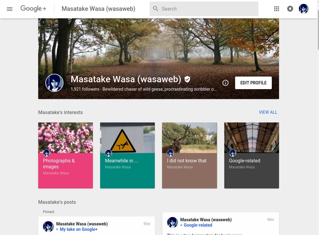
A while back I had wondered whither Google+ was heading and today we have an answer: Google is offering a new version of Google+ that users can switch to and try. There is more colour in the new version of Google+, but above all, it is noticeably faster. Speed is the decisive factor for me to prefer it over the ‘classic’ version. One way to describe the changes is to state that this Google+ is more focussed. Another way to put it is that there are many missing functions. Hangouts is nowhere to be found, events and polls cannot be created in the new version of Google+ and users will have to go back to the ‘classic’ version of Google+, and tabs are gone from the Profile page. Indeed, after Google Photos and YouTube have been separated from Google+, even Google+’s function as a profile is taken over by aboutme.
In my opinion these are good changes, and I feel that Google+ is finally becoming the product it should have been from the outset: a product that users choose to use, not forced to use because it is enmeshed into other products in a labyrinthian manner. Google+ was too ambitious and broad to begin with, but now unencumbered from many functions it can perform its role as a platform to connect and engage with others who create, curate, and contextualize content on the same interests, which is reflected in the growing emphases on Google+ collections and communities. The Explore page that opens by clicking on the search bar and the Profile page demonstrate this shift in emphases clearly. On the search page, the order is collection, communities, then profiles and pages, followed by posts that are trending, recommended, or ‘hot’ on Google+. On the Profile page, collections (and if the user has not created collections, then communities) are shown under interests below the cover photo.


For those who have been using Google+ as a hub for their Google activities from managing and sharing photographs to chatting, this leaner Google+ may not be to their taste, and for those who believe that Google+ is doomed and is bound to be shut down, the stripping of functions will appear as a further proof of their narrative. The latter is probably easier to refute, in that if Google were planning to shut down Google+, it would not have expended the resources to offer this new version. The former may comprise the most intense and ardent users of Google+, and they may feel the losses of functions keenly. Furthermore, will the emphasis on interests as represented in collections and communities instead of people and pages work out well for Google+? That remains to be seen.
There will inevitably be some adjustments and bugs, but generally speaking, and as someone who spends way too much time on Google+, I am rather encouraged and optimistic about the new version, and moreover by the direction of travel. Am I uncharacteristically too optimistic? Only time will tell.
Official Google Blog: Introducing the new Google+
